Accessibility as design language
Large type, real contrast, restrained motion, and a hyperlegible mode — not a settings menu, but the way the app looks before it accommodates anyone.
Most apps treat accessibility as a checklist bolted on at the end. A Dynamic Type setting somewhere in Settings, a VoiceOver pass, a contrast audit, ship it. Lanai works the other way around.
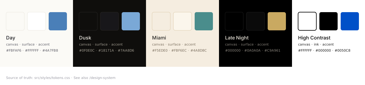
Here’s the part that matters: the biggest type size iOS offers — AX5, the one designed for readers whose eyes are getting older — isn’t the accommodation case here. It’s the design baseline. The screenshot at AX5 is composed as carefully as the one at the default. The High Contrast theme is as crafted as the Day theme. The accessibility settings aren’t a menu of allowances; they are the brand.
Why this choice
The audience choice is the easy one to explain. There’s a generation of readers — and a wider audience than just that generation — for whom most social apps are simply too small, too fast, and too loud. They want to be in the conversation. They don’t want to be straining to read it.
The harder choice is the design one. Starting from AX5 and High Contrast as the primary targets — with the smaller-default-sized layouts as the derivative — shapes every decision downstream. Type ramps that scale gracefully. Spacing that doesn’t collapse at large sizes. Buttons that work whether they’re 44 points or 88. Motion that yields to your system-level Reduce Motion preference without losing the character of the design.
What it gives you
- A type ramp that holds up at every Dynamic Type size, from the smallest to AX5
- A Hyperlegible mode that swaps in Atkinson Hyperlegible Next for body and display
- A High Contrast theme that exceeds standard contrast requirements while still being a theme you might choose, not one you have to settle for
- VoiceOver actions on posts that treat a whole post — author, body, replies — as a single navigable element, with custom actions for reply, repost, like, bookmark, share, and open thread
- Four custom rotors: posts, posts with media, mentions of you, and links
- A motion system that decelerates instead of springs, with reduced-motion paths built in from the start, not retrofitted
The brand position is small: a social app where being accessible isn’t a separate question from being well-designed. They’re the same question. The answers are what you see when you open it.